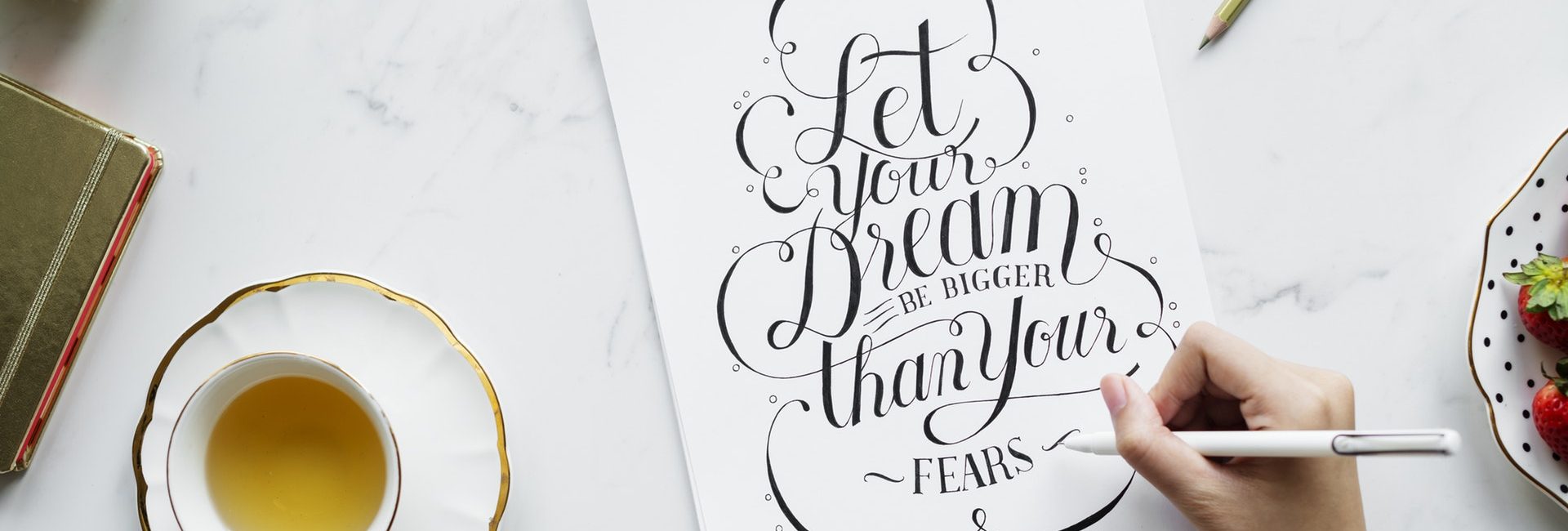


Typography T-Shirt is text-based design. For T-Shirt designers, typography is a powerful tool. It is the creative use of letters and numbers to achieve a particular look and evoke a specific feeling. This, in turn, makes the T-Shirt a statement piece. Whether you’re trying to sell a product, promote a group or a cause or send a solid message, a clever use of typography (alone or along a photo or image) can significantly help you in your goal.
Attention Grabber
Typography T-Shirts sell really well and the best ones can be the loveliest tees you will ever see. People stop you in the streets, asking where you got that T-Shirt. It’s common that when people see text on a T-Shirt, they read it. Typography on a tee elicits a reaction, it makes you think.
The Recognition Factor
Aside from being wearable art, typography T-Shirts help create and build recognition for a product or a cause you are promoting. Typography is your mark, something the public will identify time and time again. Typography might be simple but words can be powerful in themselves.
The Message and Font Style
The most popular font for T-Shirts is Helvetica. Typography on a tee will often include a mix of the most readable font sizes. For large text, blocky sans serif fonts like Helvetica, Arial, Arial Black, Verdana and Tahoma are appropriate. Serif fonts such as Courier New, American Typewriter, and Georgia are easier to read in small texts.
Your choice of font will really depend on a number of factors:
- What message do you want to send with your T-Shirt? What feeling should it evoke?
- What is the overall look you want to achieve? Does it fit the personality of your brand or organization?
- Will it go well with your brand logo or design? Does it match the weight and flow of the graphics on the T-Shirt?
Whether you’re going for a fun, sexy, cutesy, bold or traditional font, make sure it is readable.
Simple Tips for Designing Typography Tees.
Whether you’re designing a ‘message’ or ‘slogan’ tee or using typography to enhance a logo or another graphic image, these tips will help you come up with an overall harmonious look:
Select one font and use its bold and italics to create a hierarchy.
If you think the above is safe and lame, pick two fonts then that will look great together.
Modify the space between letters to achieve different effects.
If the text is longer than two lines, apply different distances between the two sentences to know what looks better.
Pick a font that will match the message. No stern-looking fonts for a fun message. Or go ahead if you want to achieve ‘irony’.
As they are harder to read, use all-caps only for short messages.
Do not stretch, skew or alter the font. This will not look good.
Look at your typography design from a distance. Squint your eyes. You will have a better perspective.
A graphic T-Shirt is very appealing and picking the right type of font enhances the photo or image used. A typography T-Shirt appears like the simpler process between the two. The message, after all, is spelled out. Still, you have to keep in mind to always use the most readable font and select the type most appropriate to the message.
